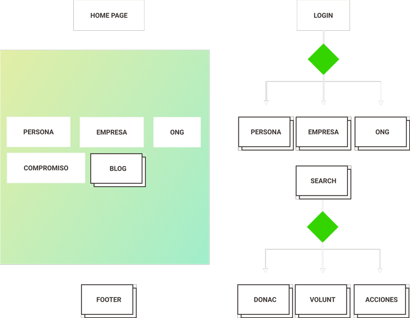
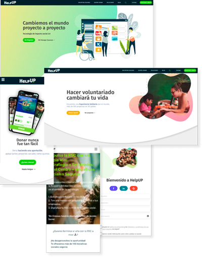
Website redesign work for HelpUP, a startup dedicated to CSR.

HelpUP was a startup that began its journey in 2017 as a volunteering platform focused on people and NGOs.
In 2019 it pivoted and became a CSR management platform for companies, continuing its volunteer work and focusing on 3 players: people, NGOs and companies.
The style of the website had become outdated, it was perceived as an NGO and not as a platform.
The objective of the redesign was to make the 3 players targeted by the application feel identified on the site and understand what the tool offered them, thus reducing the bounce rate, which at the time was 65%.
Decrease the bounce rate by at least 30%
Problems detected in the current application
67% bounce rate Advertising brings leads that are lost when they get to the web and do not find what they are looking for
No focus The focus has been lost and although it tries to target businesses, users when they enter the website believe that HelpUP is an NGO
Anarchic design A design that has been changing and trying to pivot from a website that was aimed at the general public to a new one that is aimed at companies, has passed through many hands and lost consistency and freshness.
We therefore need to cover a series of needs
Transparency In terms of message and architecture clarity to reduce bounce rate by 30%.
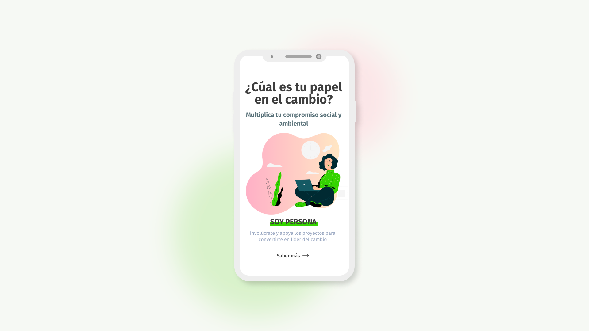
Focus Players must identify themselves and know their role from the first moment they enter the home page.
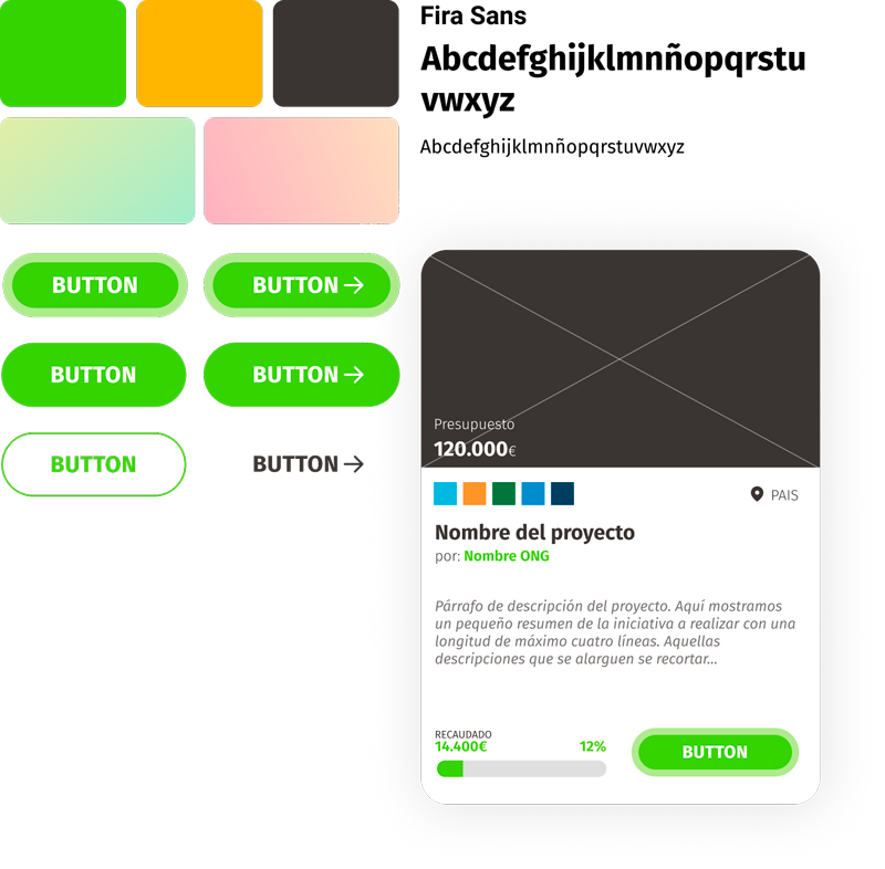
Consistency The design must breathe unity and freshness, responding to the type of social and environmental startup it is.
