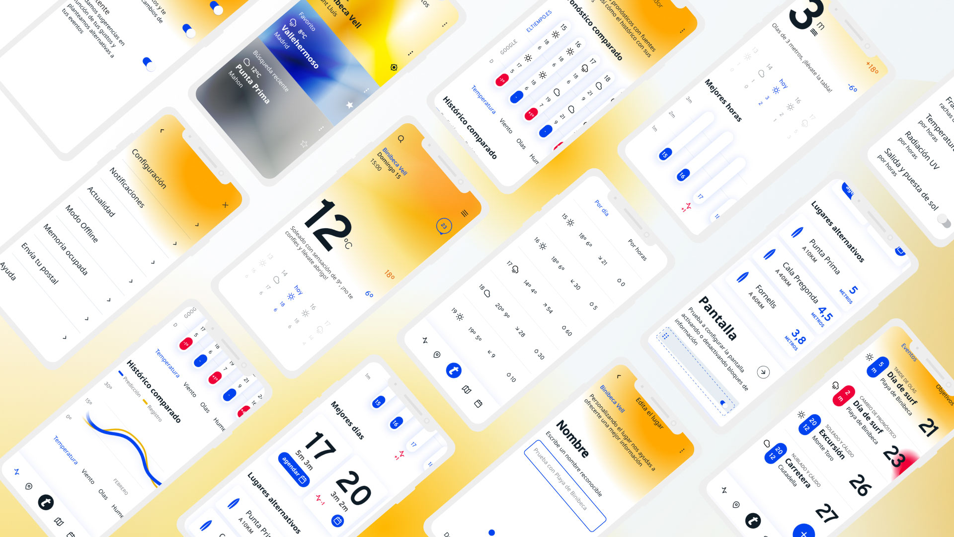
Weather forecast app UX / UI case study based in eltiempo brand

Pelmorex, one of the world's meteorology companies and owner of Eltiempo.es, has commissioned a redesign of its app
They consider that despite having a loyal audience and high-quality content, the visual level is not up to par and that a clearer architecture would help users to return to the app more frequently and thereby increase advertising revenue
They also believe that experiments to improve monetization have punished the user experience and they want a fresh start
A target that they see as special potential is that of lovers of mountain sports and those who sail
Increase returning visitor rate by 20%
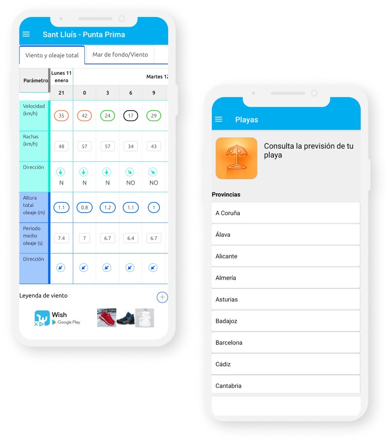
Problems detected in the current application
Usability Heavy flows and complicated architecture
Advertising Very aggressive formats
Positioning Little specific
OnBoarding Lack of OnBoarding to configure the app from the beginning
Storytelling Lack of storytelling that facilitates the reading of the data
Common patterns
We find common patterns in users regardless of their profile: athlete, traveler, teacher ...
Need for control Their activities depend on specific data and there is a great sense of mistrust
Simplicity They need to see only the data that interests them and that the app be light so that it does not affect the operation of their devices
Organization They organize their activities by time slots based on the weather and do so until the last minute in case the forecast changes
Once the insights were identified, we began to devise and prioritize functionalities that improve the experience
Comparator and historical
Working on the trust and reliability of the data will increase the recurrence of visits avoiding having to resort to other apps or websites
Customization
Customizing the content and making the app lighter will increase the conversion of new users and strengthen the link with the current ones
Agenda and monitoring
The integration of the agenda and tracking of the objectives will increase recurrence through a system of focused and useful notifications for the user
El Tiempo.es is a lightweight app that connects with your schedule of activities and offers you precisely and with verified data only the information you need


Emotional: We want to be close to the person and give him the confidence he needs through a humane treatment
Compelling: Trust and compelling are our main values and design must convey truthfulness and control
Usable: An interface that is easy and intuitive and has interactions similar to those of other apps with an always visible menu
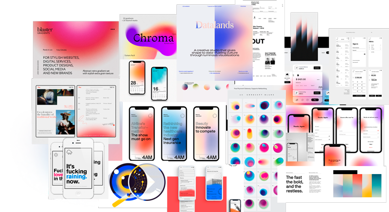
Desirable: Grab attention from the start and be visually pleasing
123456789 123456789
abcdefghijklmnñopqrstuvwxyz abcdefghijklmnñopqrstuvwxyz

InterfaceSunny Day
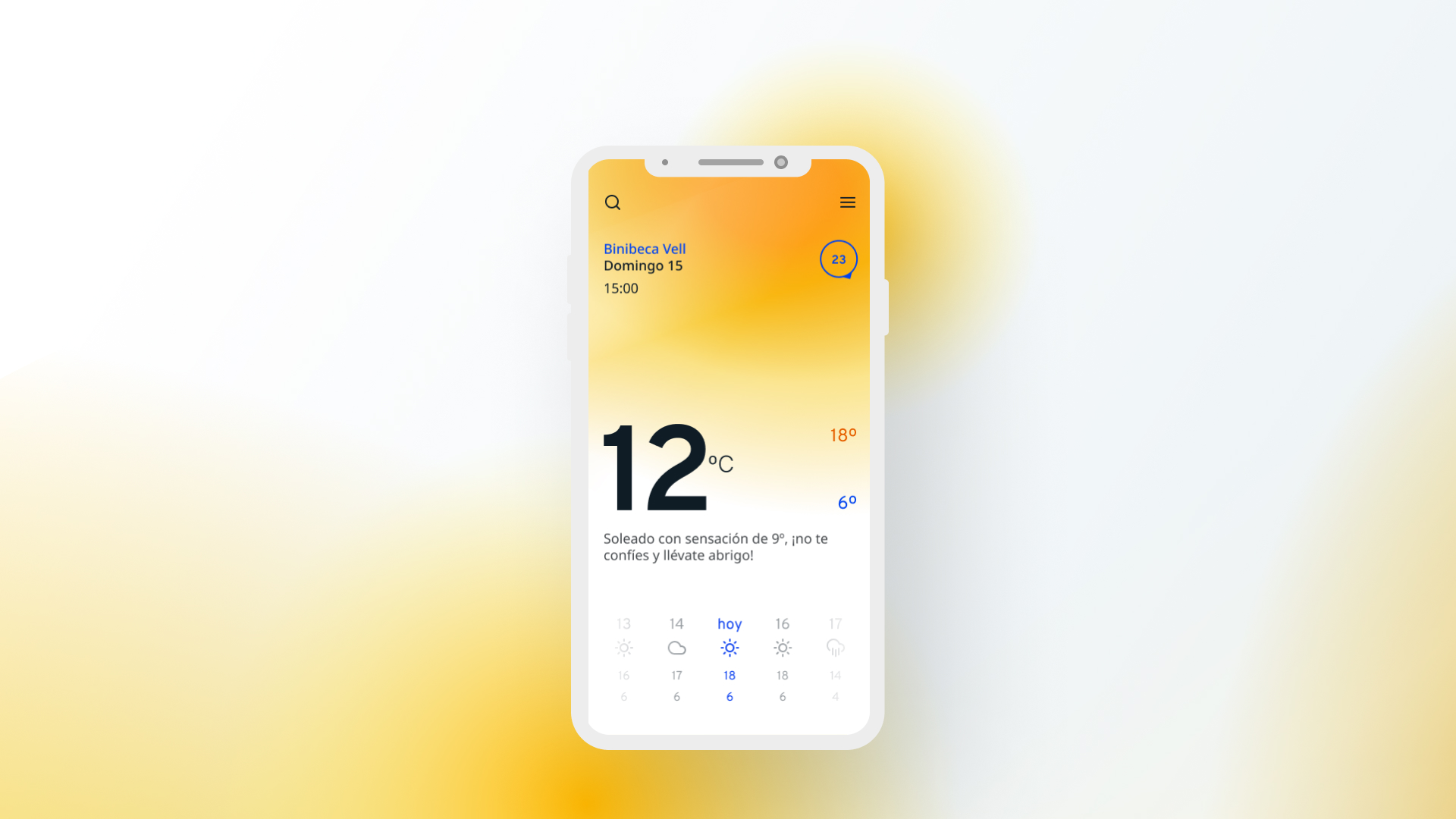
Sunny with a 9º feeling, better take your coat
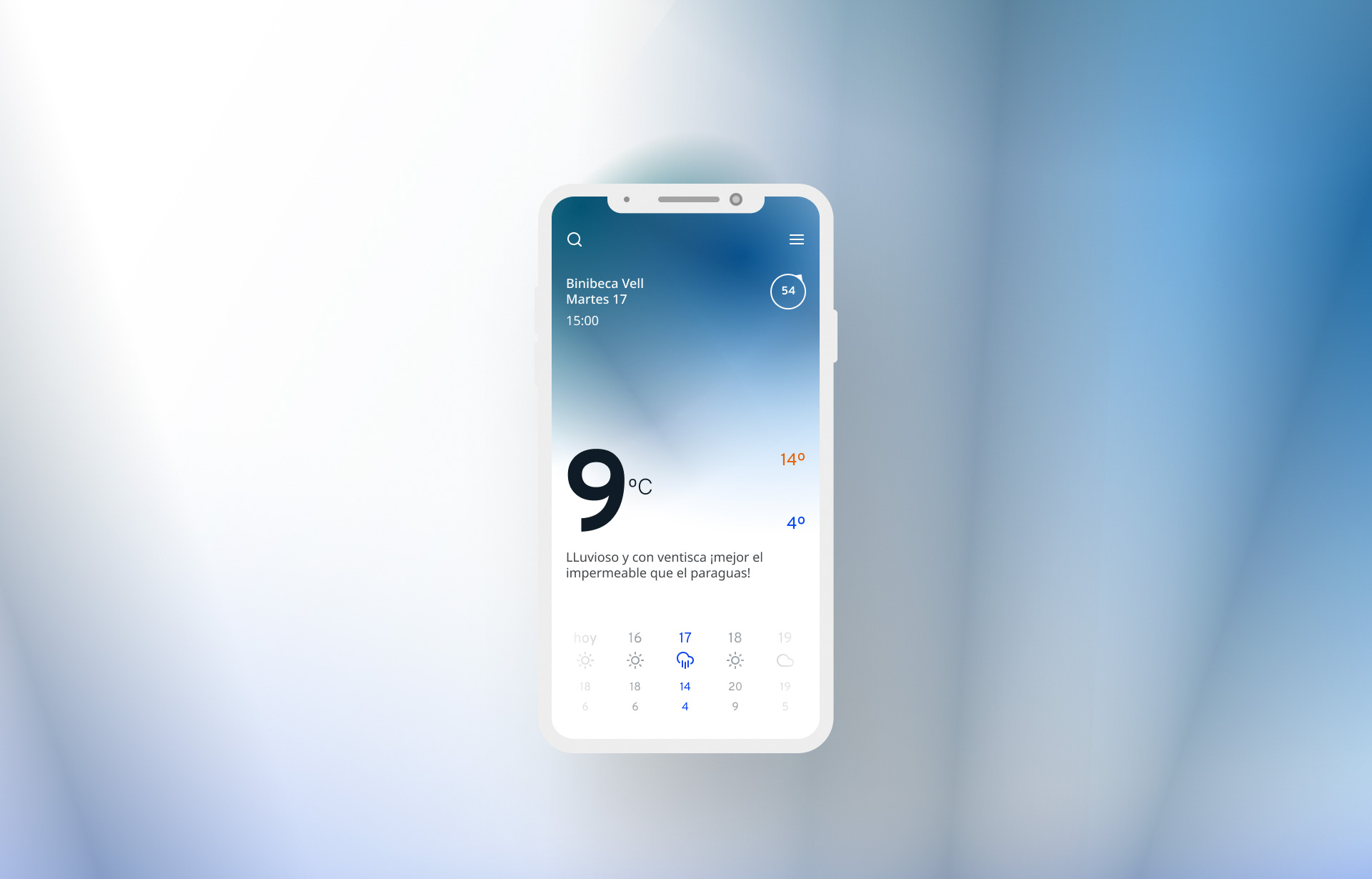
InterfaceRain Day
Rainy and blizzard, better the raincoat than the umbrella
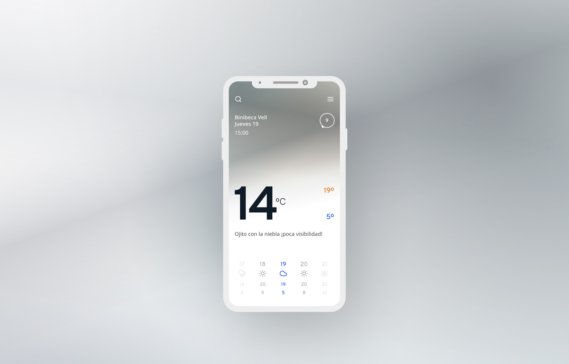
InterfaceCloudy Day
Be careful with the fog, poor visibility
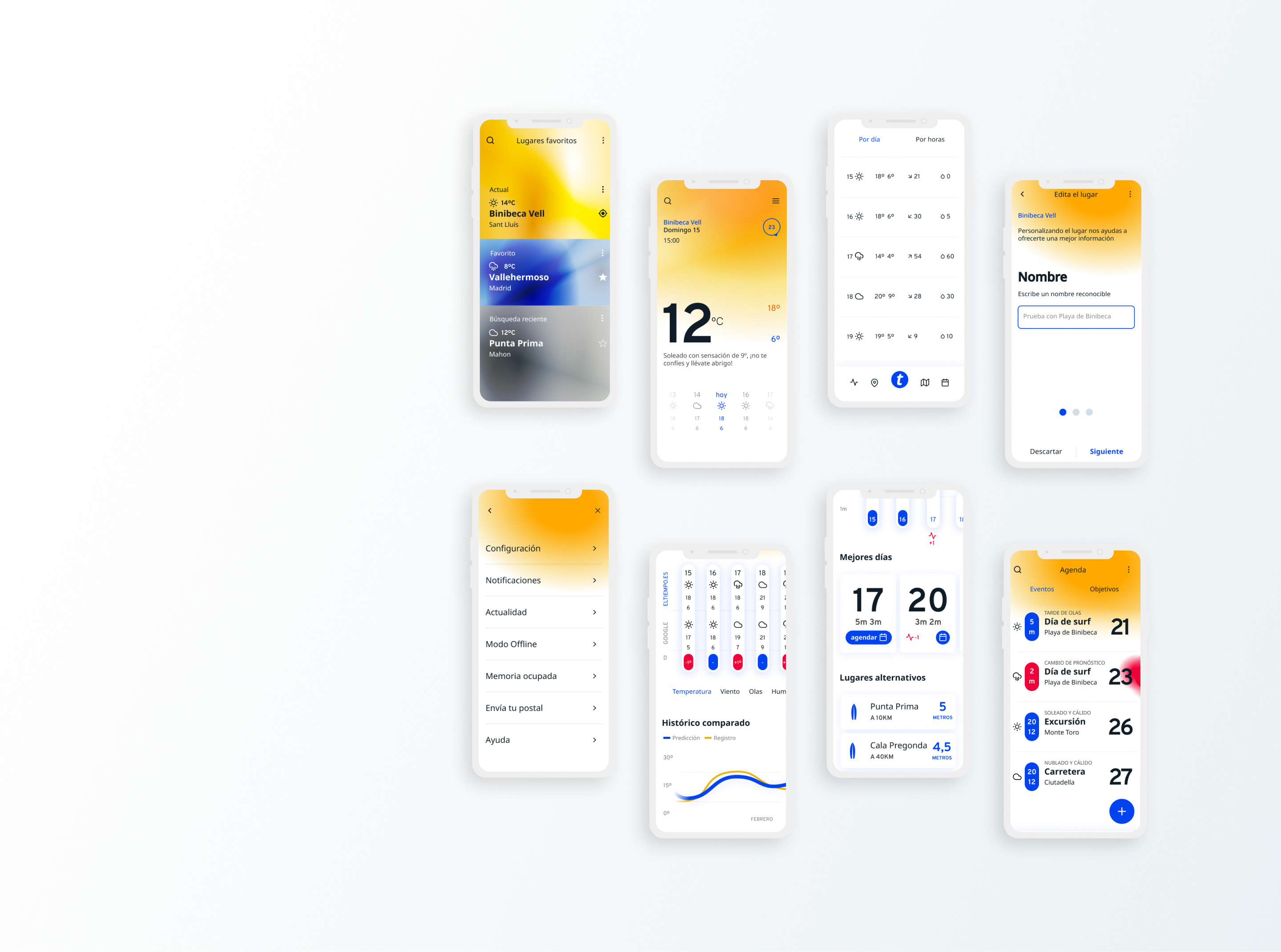
PrototypeOverview
